Frictionless Design
A UX Case Study
Introduction
Streamlining Hotel Booking
In a world where online hotel booking often frustrates rather than delights, I set out to reimagine the reservation process for my UX Design course. The goal was to craft a platform that simplifies the booking journey while offering a personalised, intuitive experience. Over 8 weeks, I applied a range of UX methodologies—user interviews, usability testing, affinity diagramming, persona development, wireframing, prototyping, and interaction design—to create a seamless, user-centred solution.
Tools
- Affinity Photo
- Affinity Designer
- Figma
- Zoom
- Miro
Role
- UX Designer
Duration
- 8 weeks
Problem Statement
The Frustration of Online Hotel Booking
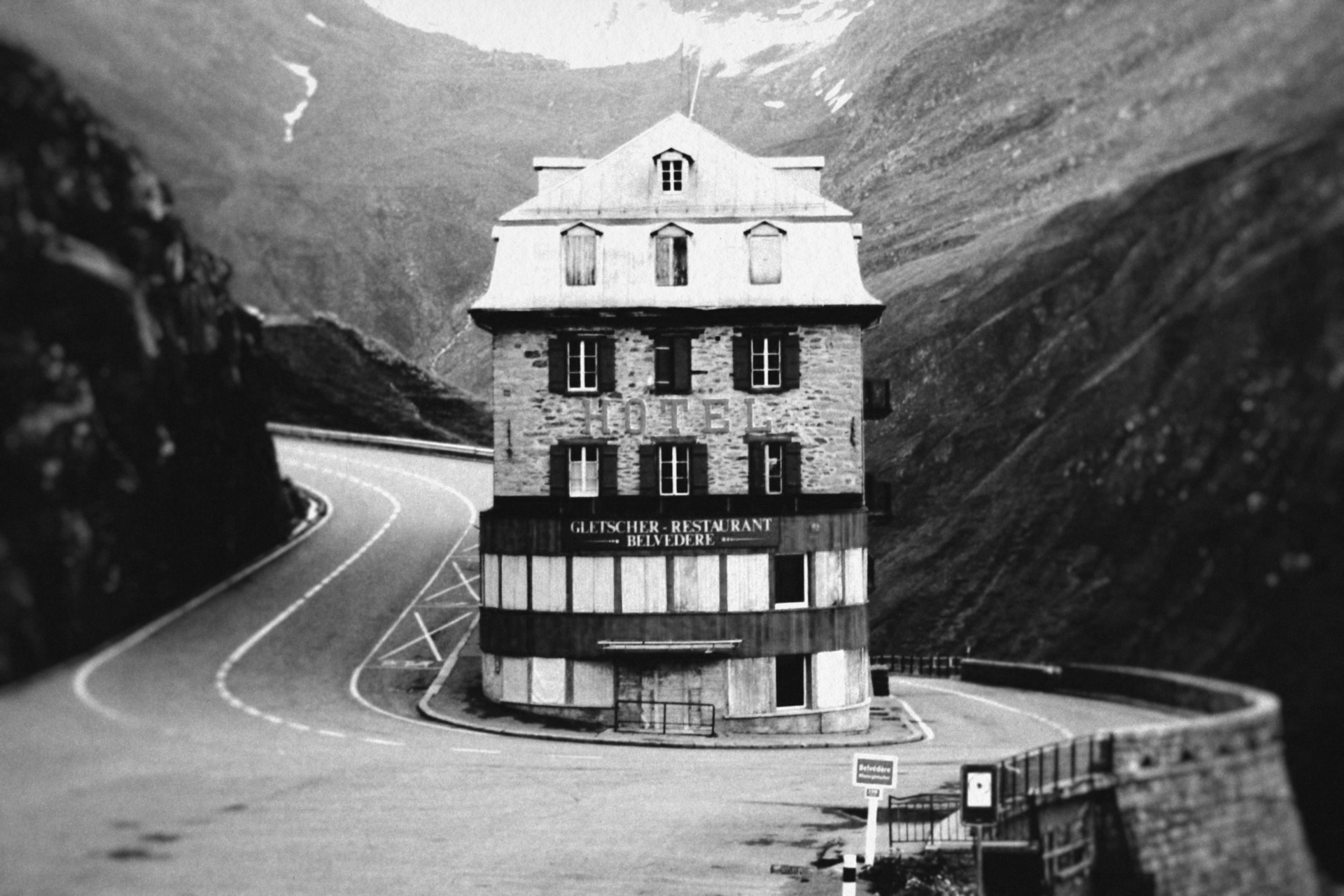
Booking a hotel online should be effortless and enjoyable, yet many travellers face a chaotic experience marked by cluttered interfaces, overwhelming options, and poor navigation. My research pinpointed three core pain points:
- Navigation Nightmares: Users struggle with convoluted menus and illogical layouts.
- Option Overload: Too many irrelevant choices lead to decision fatigue.
- Lack of Personalisation: Generic results ignore individual preferences, leaving users unsatisfied.
My mission was to transform this frustration into a streamlined, confidence-inspiring experience.
Discovery
User Research
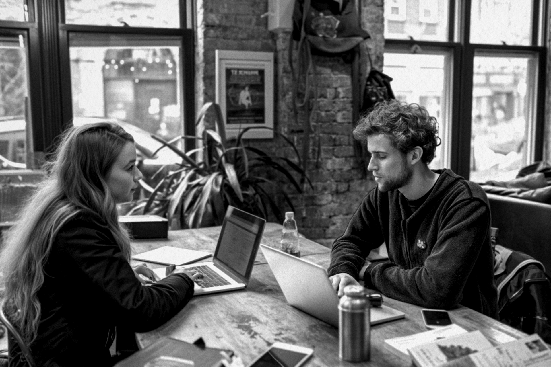
To build a solution grounded in real user needs, I conducted in-depth interviews with a diverse group of travellers and observed their interactions with two existing platforms: Barceló Hotel Group and The Doyle Collection. Using open-ended questions, I gathered unfiltered feedback on their experiences. Additionally, I analysed pre-recorded interviews to broaden my insights.
Key Insights
- Users felt lost in cluttered, hard-to-navigate interfaces.
- Overwhelming, irrelevant hotel options caused frustration and indecision.
- While clear pricing and visuals were appreciated, users craved more structured, accessible information.
Data Analysis
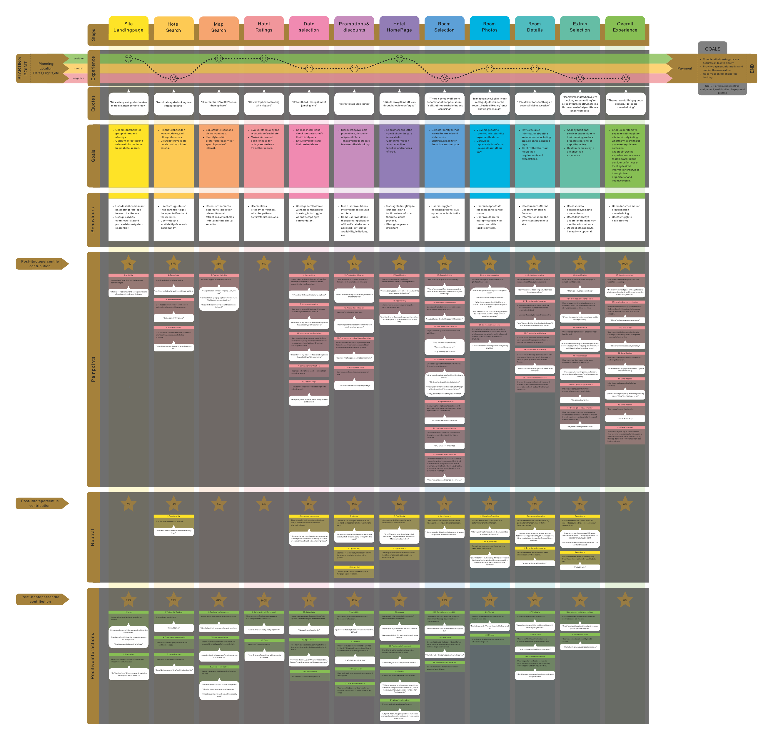
I synthesised this data using affinity diagramming and customer journey mapping. The affinity diagram grouped observations into themes—like navigation woes and personalisation gaps—while the journey map visualised each booking step, pinpointing where users struggled most (e.g., hotel selection).
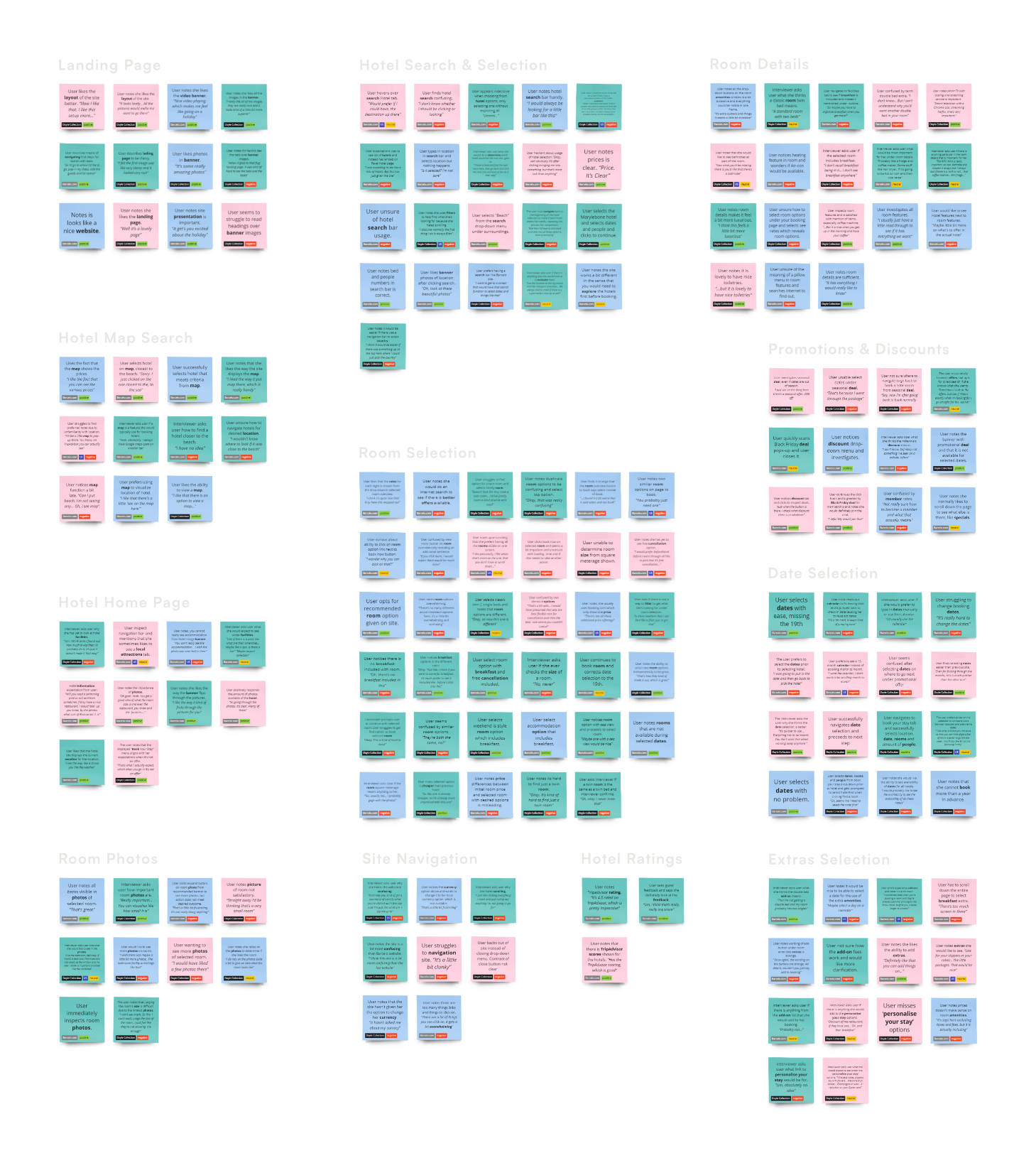
Affinity Diagram
Customer Journey Map
Key Takeaways
- The fragmented booking process led to high drop-off rates, especially during hotel selection.
- Users needed clearer visual cues and simpler navigation to feel confident.
- Personalisation was a missing link in delivering relevant results.
Design Process
Concept Development
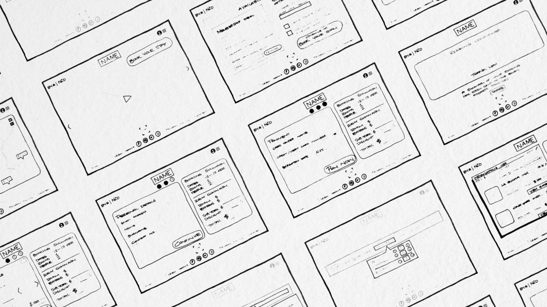
Armed with user insights, I brainstormed solutions through sketches, focusing on simplifying navigation, reducing option overload, and enhancing personalisation. Early ideas included a streamlined search bar with smart filters, tailored hotel suggestions, and a consistent visual layout to minimise confusion.
Prototyping and Iteration
I translated these concepts into user flows, wireframes, and prototypes, evolving from low-fidelity sketches to a polished high-fidelity design. Usability testing guided iterative refinements, such as simplifying filters and enhancing key information visibility. Detailed annotations ensured a smooth developer handoff, covering interactive elements, responsive layouts, and error states.
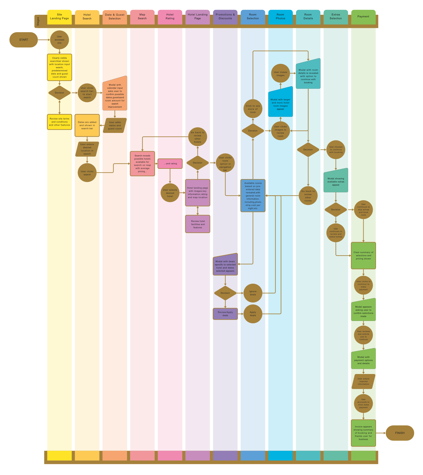
User Flow Diagram
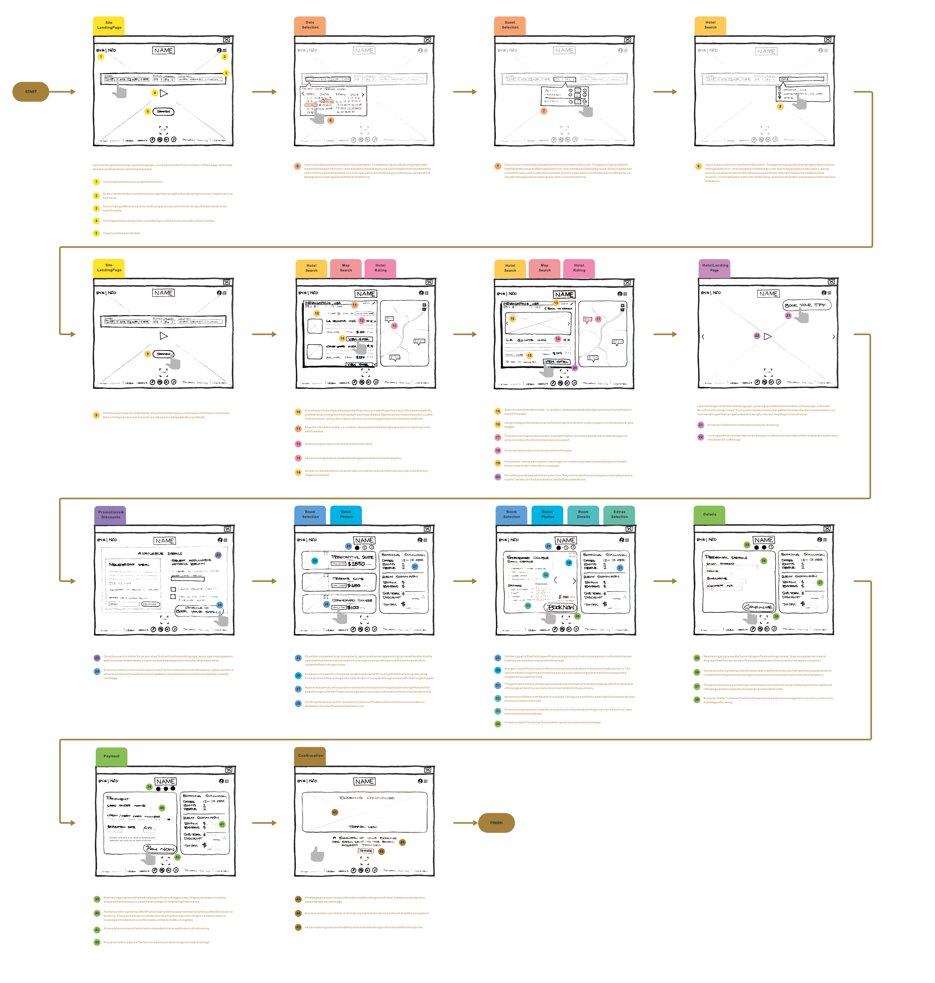
Interaction Design
Design Progression
As the design progressed and insights emerged from the research, the vision became clearer as I moved from simple sketches to low-, mid-, and high-fidelity prototypes.
Detailed Annotations
Once the Prototype is approved, I transition to detailing the aspects of the prototype for developers to note everything from the delay on page load, interactions, colours, font types and more.
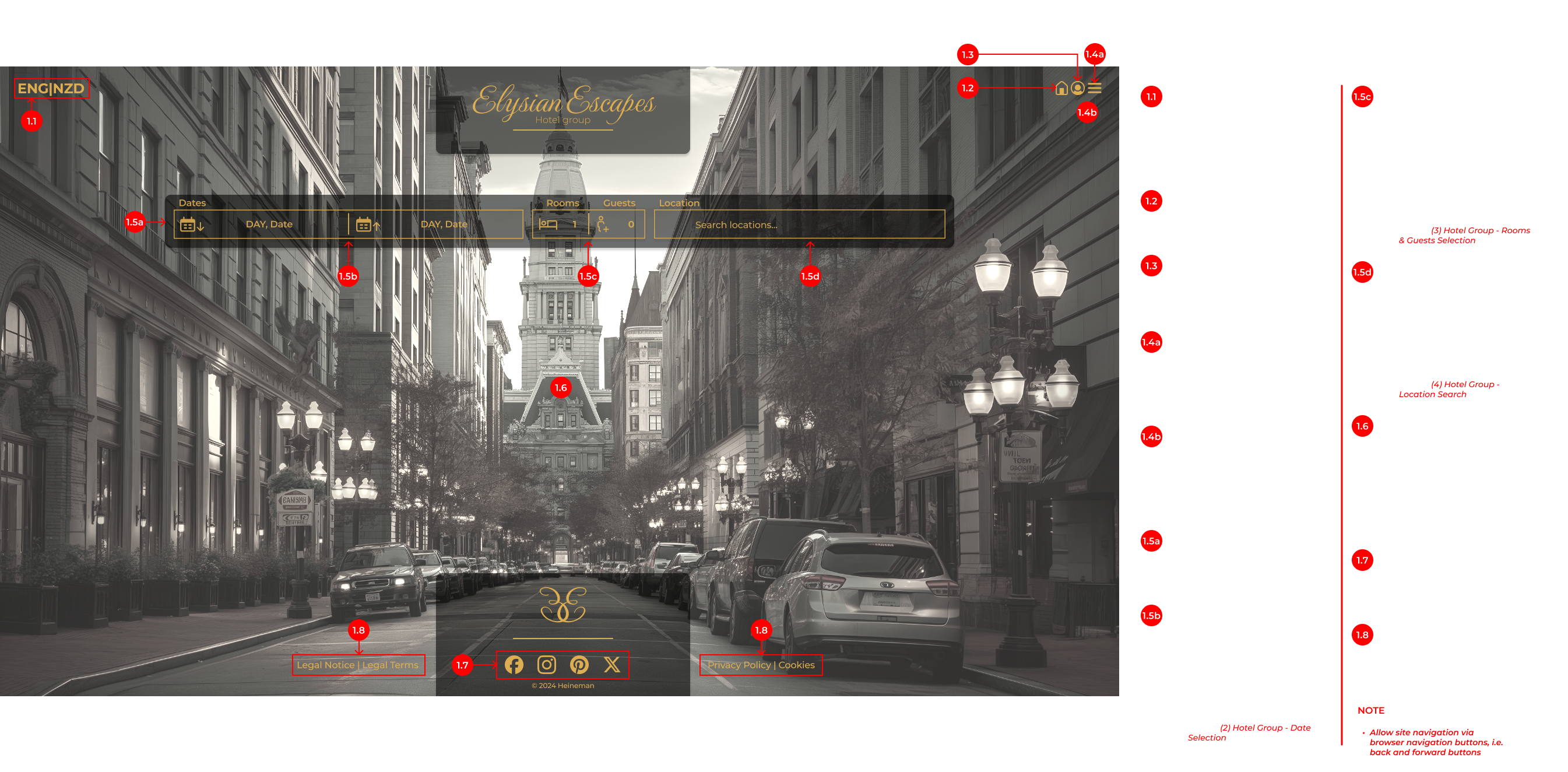
Annotations
Key Takeaways
- Visual Consistency: Standardised layouts and interactions for a cohesive experience.
- Simplified Search Interface: Reduced cognitive load with intuitive filters and clear categorisation.
- Personalised Suggestions: Tailored suggestions based on user preferences and history.
Solution
A User-Centric Booking Experience
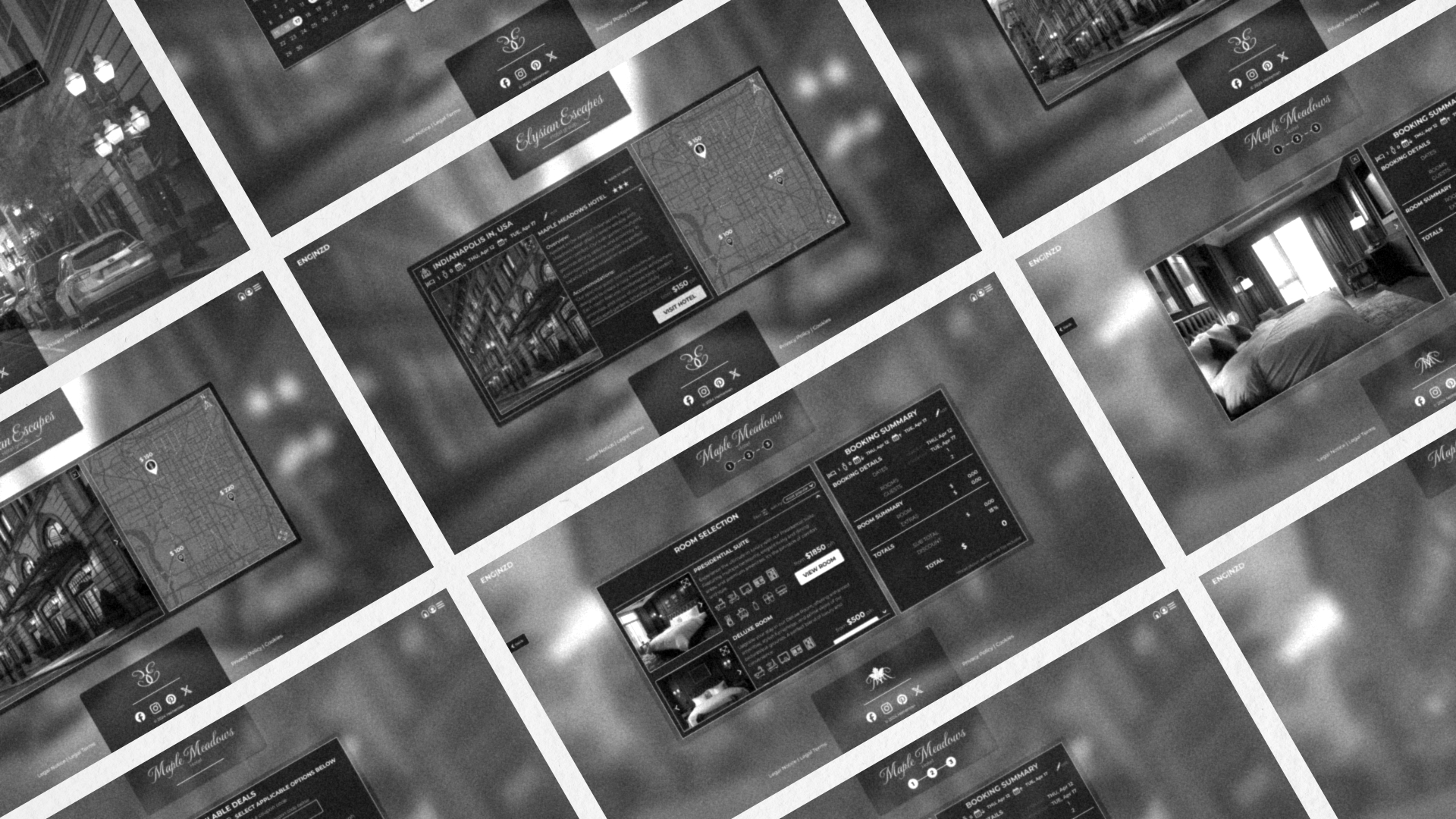
The final platform is a sleek, intuitive hotel booking solution that eliminates user frustrations with a clean interface, personalised options, and effortless navigation.
Key Features
- Visual Clarity: Minimalist layouts highlight essential information without clutter.
- Tailored Suggestions: Personalised hotel suggestions enhance relevance.
- Intuitive Navigation: Clear menus and progress indicators guide users seamlessly.
Testing and Validation
Usability Testing
I conducted usability tests with real users to validate the prototype, simulating booking scenarios to assess its effectiveness. Feedback was overwhelmingly positive, praising the ease of use and personalised experience.

Results
- 30% Higher Satisfaction: Users reported greater enjoyment and confidence.
- 40% Faster Booking: Streamlined design cut average booking time significantly.
- 95% Task Completion: Nearly all users booked successfully without help, with errors dropping by 50%.
Satisfaction
Booking Time
Task Completion
Lessons Learned
- Continuous testing validates decisions and uncovers improvements.
- Future iterations could explore deeper personalisation and accessibility enhancements.
- User-centred design drives meaningful impact, balancing aesthetics with functionality.